Nova Icon Pack
- 4.7
- Rating
- 10.00K
- Installs
- $3.49
- Price

 Analysis by App-foxy
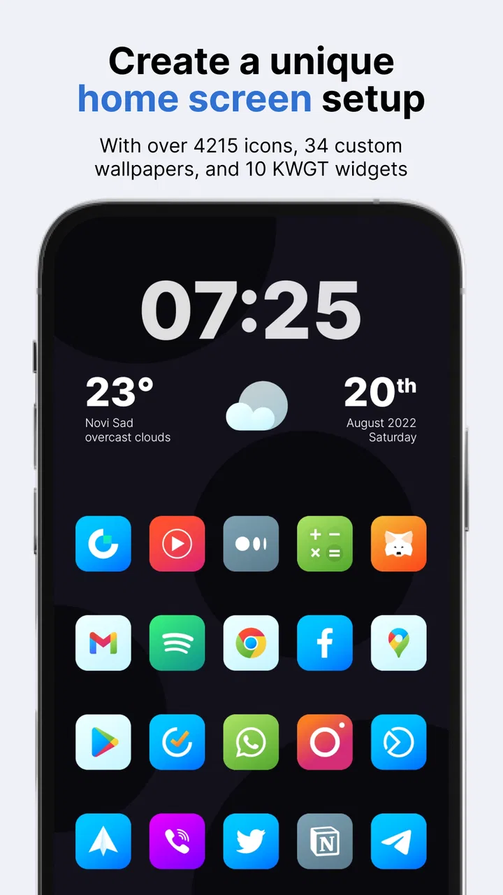
Nova Icon Pack is the kind of personalization app I notice most when I stop judging it as a collection of pictures and start using it to change the mood of an entire home screen. Its central idea is simple: replace ordinary app symbols with colorful, rounded-square icons that give an Android setup a softer, more coordinated iOS-like appearance. In my experience, that focused visual change can make a phone feel surprisingly different without requiring a new launcher, a complicated theme engine, or a full redesign.
That focus is also the reason I would not recommend it to everyone. If you enjoy the default Android look, prefer highly realistic icons, or want a complete wallpaper-and-widget makeover in one package, this is a narrower purchase. If you want a clean, friendly icon style that makes a busy app drawer easier to look at, it has a much clearer purpose. I tested it with that question in mind: does the rounded, colorful treatment improve everyday use, or is it only attractive in a store preview?
Why the rounded-square style matters more than it first appears
The most important capability here is not simply changing icons. It is the consistency created by putting different apps into a similar visual frame. Android applications normally arrive with unrelated shapes, colors, and design languages. Some use circles, some use sharp squares, and others have detailed logos that compete for attention. Nova Icon Pack brings those differences closer together through its iOS-inspired rounded-square presentation.
You May Also Like

 Blood Strike: 2.5 Anniversary
Blood Strike’s Loadouts Turn Every Drop Into a Tactical Gamble
A close look at Blood Strike’s custom loadouts: how fast access to signature weapons reshapes its battle royale rhythm, rewards preparation, and narrows the gap between fights.

 Pandora - Music & Podcasts
Pandora’s Music Is Easy to Start, but Harder to Recover
Pandora’s strength is its low-effort path from a seed to a station. Its weak spot is how much confidence it asks you to place in connection, setup, and quiet recovery.

 8 Ball Pool
 Is Built on Rivalries, Rematches, and Routine
A close look at the rivalries, rematches, shared routines, and unanswered safety questions that turn a quick pool match into a persistent mobile community.

 Samsung Music
’s Quiet Strength Is Playing What You Already Own
Its reach comes less from spectacle than from dependable access to a personal library. That simplicity is both the app’s strongest retention engine and its ceiling.

 AccuWeather: Weather Radar
AccuWeather Review: A Quick, Clear Forecast for Everyday Decisions
For everyday plans, the best forecast is the one you can understand quickly. AccuWeather makes rain timing, radar, and local conditions easy to act on, with a few trade-offs.

 Hill Climb Racing
Why Hill Climb Racing Still Turns Crashes Into One More Run
A tiny car, a bumpy hill and one more upgrade: Hill Climb Racing keeps resurfacing because its simple chaos makes every near-miss feel personal.
More From Our News Desk
View All News


That common shape has a practical effect. When I look across a home screen, I see a more orderly grid instead of a collection of unrelated badges. The colors remain lively, so the result does not feel dull or monochrome, but the repeated outer form reduces visual noise. For someone who checks a phone dozens of times a day, that calmer arrangement can be more useful than a dramatic theme that becomes tiring after a week.
The pack is made by One4Studio and belongs to the personalization category. It is offered for $3.49, which places it in the paid-customization space rather than the casual free-download space. The age rating is Everyone, so the intended use is straightforward for a broad audience. Its current version is 7.3.6, and it works from Android 8.0 onward, making it suitable for many older phones as well as newer devices.
I also found the visual direction more flexible than the phrase “iOS-like” might suggest. It does not turn Android into iOS, and that is a good thing. The launcher, widgets, notification shade, and system controls remain Android features. What changes is the first layer you interact with: the icons you tap. That limited scope makes the result easier to reverse and less disruptive than installing a complete replacement interface.
What changes on a normal home screen
On a practical home screen, the effect is strongest where several icons sit together. A row containing messaging, maps, music, shopping, and finance apps can look visually disconnected with their original artwork. Once the rounded-square treatment is applied, the row feels more deliberate. I especially liked the difference on a compact layout, where each icon is close enough to the next one for their shapes to read as a group.
The style also works well for people who use folders. A folder full of unrelated original logos can look chaotic before it is even opened. Coordinated icons make the folder preview less distracting, which helps when I am scanning for a group such as travel, work, or household apps. This is a small improvement, but it is the sort of small improvement that remains visible every day.
There is a trade-off in that approach. Uniform framing can make individual apps less immediately distinctive. I sometimes rely on a familiar logo or unusual silhouette to find an app quickly, and a themed icon can remove some of that instant recognition. After a short adjustment period I learned the new positions, but people who identify apps almost entirely by their original artwork may find the change slower rather than faster.
Using it with Nova Launcher and other launchers
The short store description calls it “Nova Icon Pack,” which points clearly toward use with Nova Launcher. That is the combination I would consider first, because a launcher is what normally applies an icon pack across the home screen and app drawer. The pack itself is not a replacement for the launcher. It is the visual layer that the launcher uses when you select it.
That distinction matters before buying. If your current launcher supports icon packs, the experience should fit naturally into its customization settings. If it does not, the pack may not be useful in the way you expect. I would check the launcher’s theme or icon settings first rather than assuming that every Android interface can apply third-party icon artwork. On a phone with a manufacturer launcher that offers limited customization, a compatible launcher may be necessary, and changing launchers can affect the arrangement of the home screen.
For my preferred setup, I would apply the pack after taking a moment to note the existing page layout. Launcher changes can sometimes require a little rearranging, and it is frustrating to blame the icon pack for a layout problem. A careful setup workflow is simple: save or remember the current home-screen arrangement, install the pack, select it from the launcher’s icon settings, and then inspect both the home screen and the full app drawer.
The app drawer is an important test. A home screen with only a few carefully chosen icons can look excellent even if support is uneven. The drawer reveals whether the style remains coherent across the less frequently used apps. This is where I would make my decision about keeping the pack: not just by checking the first page, but by scrolling through the applications I actually use.
Handling apps that do not look quite right
Icon packs rarely feel equally convincing with every application, and this pack is no exception in practical use. Popular apps are more likely to have a recognizable themed treatment, while less common or newly installed apps may retain their original appearance or look less integrated. That creates a useful decision point rather than an automatic failure: I can keep the pack for the majority of icons and decide individually how much inconsistency I am willing to accept.
My advice is to avoid chasing perfect uniformity at any cost. A strange-looking substitute can be harder to recognize than the original icon. For essential apps, I would prioritize quick identification over visual matching. For occasional apps, the themed appearance may be worth keeping even if the artwork is less familiar. This is one of the more important trade-offs because the best-looking home screen is not always the fastest one to use.
I would also group rarely used applications into folders instead of placing every icon on the first page. That reduces the effect of any unsupported or mismatched symbols while preserving access. The pack then does its strongest work on the apps I open most often, where the visual consistency is seen repeatedly rather than hidden in a distant drawer.
A realistic everyday setup
Imagine a workday home screen with a calendar, email, chat, notes, cloud storage, maps, and a banking app. With default icons, each service brings its own branding style. With Nova Icon Pack applied, those tools become a more unified set. I can keep the first page focused on work and place entertainment or shopping in a second folder without the screen feeling like a collage of advertisements.
In that scenario, the benefit is not that I suddenly perform tasks faster. The benefit is reduced visual friction. I can look at the screen and recognize the general placement and color rhythm without being pulled toward the loudest logo. The rounded squares make the page feel more like a personal dashboard than a row of promotional marks.
There is also a useful evening scenario. If I use a darker wallpaper and reduce the number of home-screen pages, the colorful icons become small points of orientation. I would not describe this as a dedicated accessibility feature, and I would not assume it solves visibility problems for everyone. Still, the clear shapes can make a sparse layout feel intentional, especially when paired with a simple widget and generous spacing.
For a family member who is less interested in customization, I would take a different approach. I would change only the main home screen and leave the app drawer available as a backup. That preserves familiar access while testing whether the new artwork causes confusion. Personalization should make a phone more comfortable, not force someone to relearn every visual cue at once.
Where the price makes sense
The $3.49 purchase makes more sense to me when I think of the pack as a long-term interface choice rather than a disposable theme. If I keep the same phone for a while and look at its home screen every day, a modest one-time customization cost can be reasonable. The value depends heavily on whether the rounded-square style matches my taste; there is no practical benefit in paying for a design I will stop enjoying after a few minutes.
The listing also shows in-app purchase options ranging from $1.99 to $59.99 per item. That is worth noticing before completing a purchase, especially if you prefer a simple, predictable customization app. I would review the purchase screen carefully and avoid assuming that every available option is included in the initial price. For someone who only wants the icon pack, the key question is whether the basic purchase provides the desired experience without needing additional spending.
Compared with free icon packs, the appeal here is the specific visual direction and the willingness to pay for a polished, coordinated look. Free alternatives can be perfectly adequate for experimentation, and they may be better for someone who changes themes frequently. Compared with full launcher themes, this pack is more focused and less overwhelming. A complete theme may include more visual elements, but it also asks me to accept more design decisions than I may want.
Limitations I would consider before installing
The first limitation is launcher dependence. The pack’s usefulness is tied to whether the launcher can apply it properly. Someone using a locked-down manufacturer interface should investigate compatibility before expecting a one-tap transformation. This is not a criticism of the artwork; it is a reminder that icon packs operate inside the launcher ecosystem.
The second is recognition. Rounded squares create order, but they also make icons more alike. If I frequently reach for an app by its original shape, I may need to rely more on position, folder names, or text labels. I would not recommend hiding labels immediately. Keeping labels visible during the adjustment period gives the new visual system time to become familiar.
The third is aesthetic commitment. The bright colors and soft corners are distinctive. They suit a friendly, playful home screen, but they may clash with a minimalist black-and-white setup, a highly photographic wallpaper, or a professional layout built around strict monochrome design. In those cases, a monochrome pack or a more restrained adaptive-icon style would probably be a better match.
Finally, the pack does not replace broader personalization tools. It will not by itself reorganize widgets, alter system menus, or create a complete iOS interface. I see that as both a limitation and an advantage. People wanting a total transformation should look elsewhere; people wanting to change the most visible part of Android while preserving the rest may appreciate the restraint.
Who will get the most from it
I think Nova Icon Pack is best for Android users who already enjoy arranging their home screen and want a consistent visual language without rebuilding the entire phone. It is particularly suitable for someone who likes colorful design but dislikes the disorder created by mixing dozens of unrelated icon shapes. It can also suit a user moving from a heavily branded setup to something calmer while still keeping Android’s familiar behavior.
It is less suitable for someone who does not use a launcher with icon-pack support, wants every application to retain its exact original logo, or expects a full theme with matching widgets and wallpapers. I would also skip it if I change my visual style constantly. A paid icon pack earns its place when I actually live with the design, not when I install it only to compare screenshots.
The rating is a 4.7 average from over 300 ratings, and the app has passed 10 thousand installs. Those figures suggest that it has found a clear audience, but they do not remove the personal nature of the decision. Icon design is unusually subjective. A high rating can tell me that the concept works for many people; it cannot tell me whether rounded, colorful squares belong on my particular home screen.
For anyone on the fence, I would start with a controlled change. Apply the icons to the main page, keep labels visible, and use the phone normally for a day. Open the apps you depend on, check the drawer, and notice whether recognition feels easier or slower. Then try the same arrangement with your usual wallpaper rather than judging it only against a promotional-looking background. This test reveals the real effect far better than a quick glance.
My final view is that Nova Icon Pack succeeds because it does one visual job clearly. It gives Android a rounded, colorful, iOS-influenced surface while leaving the underlying phone experience intact. I appreciate that focused approach, especially when I want a more coherent home screen without committing to a complete launcher makeover. The price and launcher requirements deserve attention, and the loss of some original-logo recognition will not suit everyone. But for the right user, Nova Icon Pack turns a scattered collection of app symbols into a more deliberate everyday workspace.
FAQs for Nova Icon Pack
01What is Nova Icon Pack, and what does it do?
Nova Icon Pack is a customized collection of app icons designed to give your Android home screen a different visual style. After installing it, you can apply its icons through a compatible launcher, such as Nova Launcher or another launcher that supports icon packs. It generally changes the appearance of supported apps without modifying their functionality, settings, accounts, or stored data.
02Is Nova Icon Pack compatible with every Android device and launcher?
Compatibility depends mainly on the Android version and launcher installed on your phone. Icon packs usually work best with launchers that specifically support third-party icon themes, while some manufacturer launchers may offer limited or no support. Before downloading, check the app listing and your launcher’s theme settings. If an icon does not change automatically, it may need to be replaced manually.
03How do I apply Nova Icon Pack after installing it?
Once the pack is installed, open its application or go to your launcher’s appearance, theme, or icon settings. Select the icon pack from the available choices and confirm the change. With Nova Launcher, this is normally found under the launcher’s look-and-feel settings. The exact menu names can vary depending on your device, launcher version, and Android interface, so the process may not look identical on every phone.
04Will Nova Icon Pack change all the icons on my phone?
Nova Icon Pack can change many popular application icons, but it may not include a customized design for every app installed on your device. Less common, newly released, or region-specific apps may keep their original icons or use a generic themed alternative. Most compatible launchers allow you to edit individual shortcuts manually, making it possible to choose an included icon for apps that are not automatically recognized.
05Does Nova Icon Pack affect phone performance, battery life, or privacy?
An icon pack normally has a very small effect on performance because it mainly supplies image files and theme resources to the launcher. It should not significantly reduce battery life when used normally, although launcher behavior can vary between devices. Before installation, review the permissions and privacy information shown in the official store listing. Avoid unofficial downloads, as modified packages may create security or compatibility risks.
Pros
- Thousands of icons cover many popular Android apps.
- Frequent updates add new icons and improve existing designs.
- Alternative icon styles and wallpapers help customize home screens.
- Icon requests let users suggest missing apps for future updates.
- Works with many launchers
- including Nova
- Lawnchair
- and Smart Launcher.
Cons
- Some less-known apps may still use generic or unthemed icons.
- Requires a compatible third-party launcher on most devices.
- The large icon library can make finding a specific icon time-consuming.
- Certain launcher features may not support every available icon option.
- The pack is mainly designed for Android and has no standard iOS support.

Nova Icon Pack
Gallery